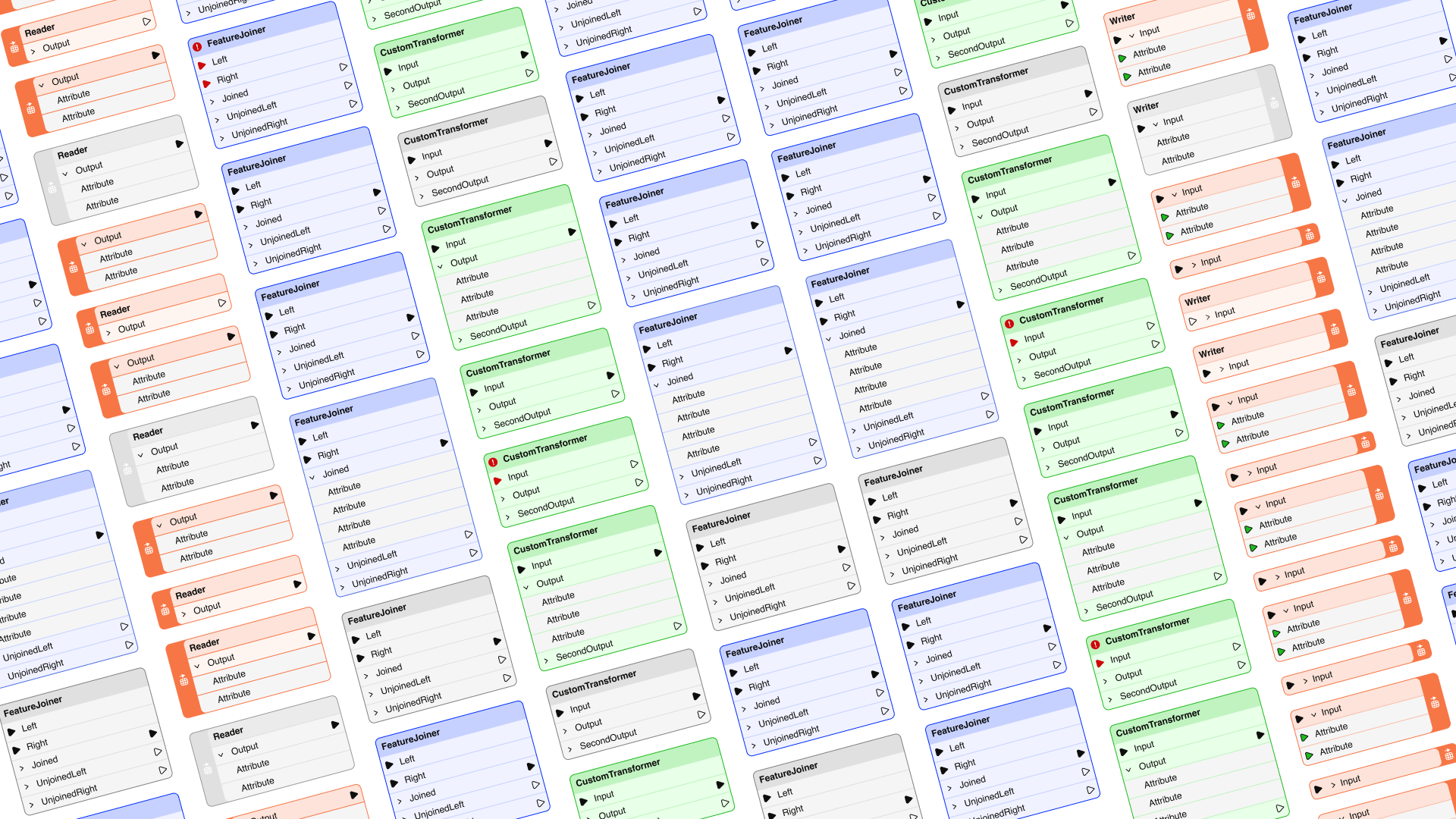
FME has long stood at the forefront of data integration, offering unparalleled productivity through its ability to connect thousands of systems and perform a wide range of transformations and automation. We are excited to share how the workspace authoring experience has evolved in the release of FME Form 24.0. Prepare to interact with your workspaces like never before, as we make them less visually complex and more joyful to navigate.
The new design aims to help our users:
- Stay focused on what matters the most when authoring workspaces.
- Craft workspaces that are easier to organize and are visually more appealing.
- Enjoy the experience of consistency when moving between FME Form and FME Flow.
A User-Centric Design Philosophy
At the core of the FME Form redesign lies our dedication to placing user needs at the forefront. We’ve reenvisioned the interface to emphasize focus and organization, allowing you to effortlessly bring life to your data. This redesign is more than just cosmetic changes, focusing on enhancing usability to ensure your interactions with FME are not only productive but also genuinely enjoyable.
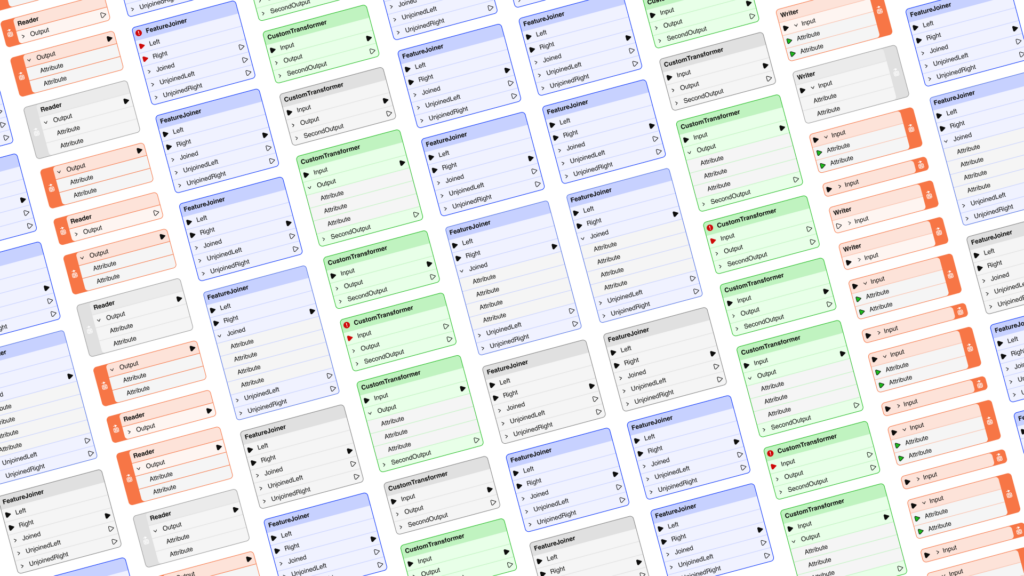
Visual and Functional Improvements
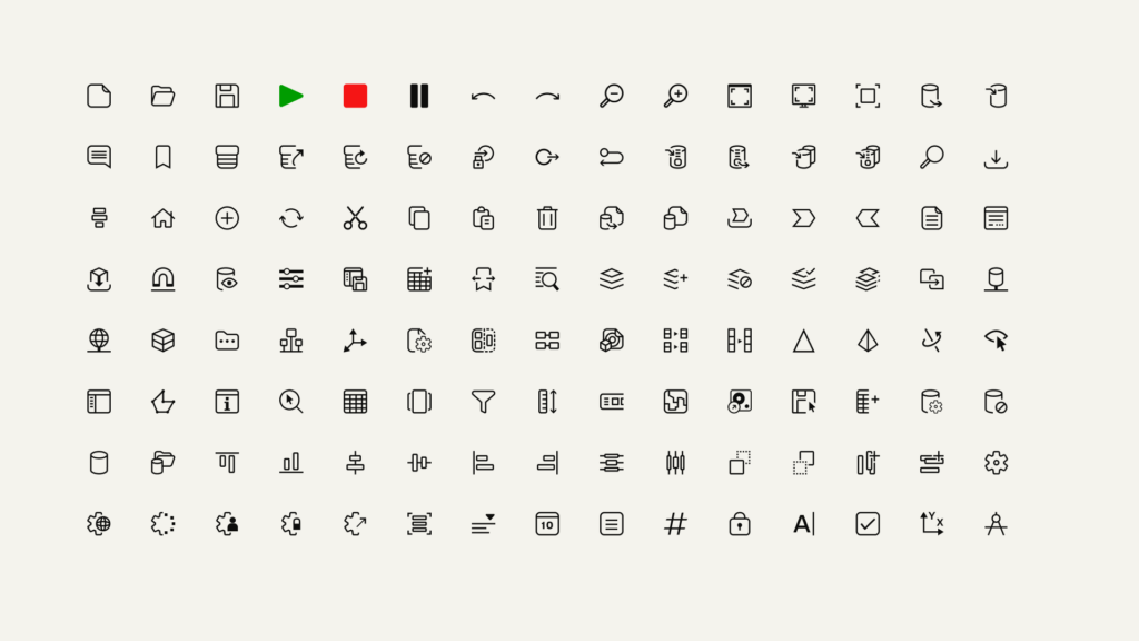
We recognize that the more we enable users to focus and work uninterrupted, the more productive they can be. For this, we moved to a new icon system that uses color to direct your attention to the next likely action at each stage of authoring. Beyond the use of color, we improved how certain icons appear. Here are some highlights:
- Navigator icons only use a red color if they represent an incomplete transformer or parameter.
- Toolbar icons only use a green color if they represent running a data translation.
- A red warning icon only appears on incomplete transformers.
This redesign was informed by an extensive audit and feedback from our community, reflecting our commitment to not just meet, but surpass your expectations.
Bridging the Old and New
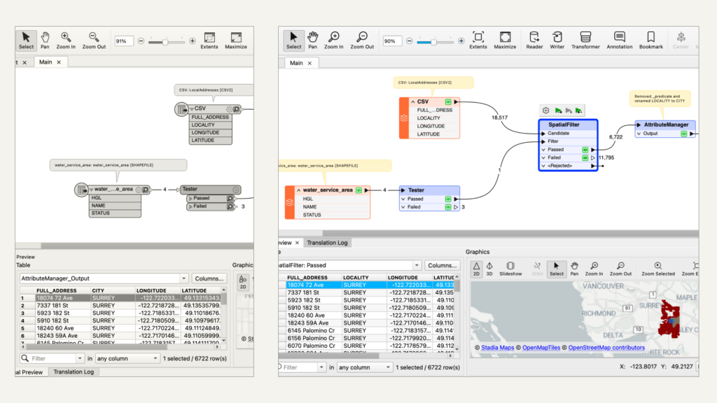
Embracing change while valuing comfort, we have ensured that the new design feels like a natural extension of the FME you know and love. While we venture into new design territories, we preserve the core elements and color semantics that have been fundamental to the FME experience. This maintains the essence of FME while propelling it into a new era of user satisfaction.
Here are several examples of things that didn’t change.
- We did not change the semantic use of color in canvas and icons. Regarding incomplete objects or parameters, we still use the color red.
- We kept using colors from the same family as before for different objects on canvas. This ensures our existing users do not have to re-learn what each object represents.
- We preserved the symbols representing various concepts and actions as long as they would not cause inconsistencies with the rest of the icons.
Minimal Design for a Zen Experience
The redesign of the FME Form is more than an update; it’s a reimagining of how serene and joyful the workspace authoring experience can be. Through deliberate design choices, such as rounded corners and a harmonized color palette, you can craft workspaces that not only look more appealing but also promote a sense of calm and focus. This commitment to a minimal yet effective design philosophy ensures that your journey with FME is as rewarding as the outcomes you achieve.
As we celebrate the release of FME 24.0, our vision for FME’s future remains clear and ambitious. We are committed to continuous improvement, always seeking ways to enhance the user experience and meet the evolving needs of our community. Welcome to the new FME Form!
Together, let’s embark on this exciting journey, shaping the future of data integration with every step. If you are interested in actively participating in the shaping of FME’s future, join the FME Explorers program, where you’ll be invited to provide feedback on various design/development projects.
See what else is new in FME 2024.0 and download it here.
